Posts

Number 49 of 52 Portraits: Grateful

Image
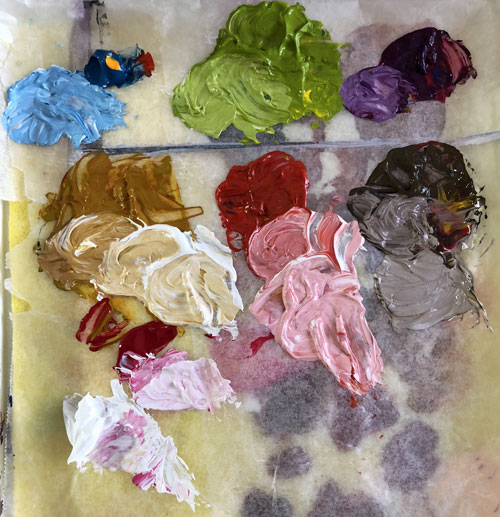
This started out more or less following along with Emma Petitt 's activity as part of the LifeBook Summit that was held just prior to LifeBook 2019 going on sale. Initially, I followed her steps -- which was very loose sketching and loose paint strokes. The face was almost finished when I decided it was all wrong and started most of the way over. Not only that but pages got stuck together and tore, so I had to glue two pages together as well. After that, I covered up all the words, redrew the face using a different reference image and repainted it, using the same colors I had picked out before: yellow ochre, light portrait pink, teal, quidacridone nickel azo gold and white gesso for mixing. Teal and gesso were the only colors that Emma used: she used a different yellow, red and pink. Emma left hers with a lot of white showing, adding to that loose look but I kept on going (of course) and wrote some words in orange Inktense pencil in her shirt to finish it up. I brushed over ...
Number 48 of 52: Saint Gobnait

Image
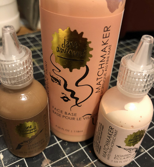
Saint Who now? Well, I was intending the next portrait to be Saint Gobnait (Irish patron saint of bees) but she ended up here instead, even though this was just meant to be playing with Jane Davenport's new paint. It's called Matchmaker paint and starts with a base color (in the middle) and darkening and lightening paint (I'm sure you can figure out which is which). In a video demonstration (you can find it on YouTube) she showed how she uses this as a base color for a face and then used her other products to provide shadows and highlights. As an aside, she mentioned you could mix the three colors to create the shadows and lights as well. Right, I thought, let's give that a go. I started with a sketch. And then put down the first layers. I used just the darkening drops for the darkest darks and just the lightening drops for the lightest lights and then various mixes of each in between. Not exactly done yet... so I added more layers, lightening up much...

Number 47 of 52: Creating with Dramasticks

Image
Jane Davenport's new collection is out, so I splurged on some Dramasticks (ok and a few other things), which is like a really soft oil pastel that dries hard. I had a background already made with leftover paint from the previous portrait (Rose Girl) which was a bit of Jane Davenport paint with a lot of Golden heavy body Titanium White mixed in. It ended up with a square of Cobalt Violet hue in the corner too. (Yummy packaging, am I right?) I started with a pastel pencil sketch over the paint. As I started adding some chalk pastel for shading (not Jane's), I realized that the paint was too slick, so I fixed most of the lines with some clear gesso and added more across the surface of her face so the pastel would have something to grip onto. I found the drama sticks both deliciously moveable and really messy. I really would recommend using Q-tips, tortillions (those pointy paper sticks) or makeup sponges. Jane's line also has something, but of course I didn...

Number 46 of 52 Portraits: Rose Girl

Image
I finished this one in almost one sitting. OK, so I had some leftover paint from the Mary Magdalene portrait and put that down in a loose face shape along with some leftover green because you can't put paint back into a tube. A couple of  nights later, my husband wanted to watch some soccer thing so I sat down to paint and finished it all except for the final touches. So progress photos? You've seen them. It. Just the one. I'd had a really stressful day and it all melted away with the meditative strokes. First in painting the face, which I attempted to do the way Melanie Rivers does. (There's a free lesson on her website. Love her paintings.) I didn't exactly follow and sort of meandered off into my own thing a bit. I didn't use a reference photo either. Then with the repetitive strokes of laying down paint for all the petals and mixing in the white. All the stress was gone and I was in a happy place. These are the supplies I used. I didn't even cl...

Number 45 of 52: Mary Magdalene

Image
OK I am going to be upfront honest. This one isn't exactly finished, but the rest of the painting is not a portrait so I'll be working on it between the other two. I stumbled across a theory that Mary of Magdala was a nickname, like Peter the Rock. She was Mary the Tower. However, there is much disagreement on this. Not that it matters because inspiration had well and truly struck. This one is not in my journal but on canvas. I used a Lyra pencil to sketch in the face using a reference image from unsplash. As you can see, using the Lyra pencil I was able to start to do some shading. Then using the leftover paint from portrait number 44, I put down some first layers. But I didn't like her eyes being closed. Mary of Magdala had her eyes opened at the tomb and preached the good news. She was the apostle to the apostles. I painted additional layers,  using shades of raw sienna and burnt sienna. So, I used a reference photo that I had taken for placement of the eye...

Number 44 of 52: quick self portrait

Image
I was going through my basket of washi tape, looking for good colors to use in my Fall Studio Yearbook, and I came across four Faber Castell Pitt pens. I checked and sure enough, they were duplicates. So I thought I would challenge myself to use those (and a white Posca pen and a Lyra water-soluble pencil) to do a portrait. First, the sketch. I started with the lightest shadow color and discovered it was almost dried out. Oops. Did I go use the other one in the same color that I had? Of course not. I kept going with the others and used the white Posca pen to blend it together. I did this on a piece of regular copy paper so it quickly soaked up the ink making it difficult to move and blend. Gessoing the paper first might have been a good idea, but oh well. And here's the result: It's a self portrait but I couldn't be bothered to figure out the glasses (and teal wasn't one of the colors anyway) so I have left it as is. I have another one that is well u...

Two Archetypes: Number 43 of 52 Portraits

Image
This portrait is based on a LifeBook 2018 lesson where we learned what our archetypes are. They aren't constant and are supposed to change. So I took the provided quiz and decided to do a portrait featuring two of my archetypes (as of the beginning of this month): the Engineer and the Eternal Child. Did I find this concept particularly helpful? Not at this surface, introductory, level. Perhaps they are of use if you dive deep into them, but this wasn't that. However, painting two of them was fun. I went back to my trusted Golden Heavy Body paints and put together a palette from Titanium White, Cerulean Blue Deep, Cadmium Yellow and Quidacridone Magenta. I sketched out a face on page where I'd been "wiping off" paint brushes and the like, and glued down some collage pieces around the edge. One side of the face is the "Eternal Child" I started out with Pebbles-like pigtails and greens and purples. She's even wearing a Peter Pan collar. (A...